

I've been seeing plenty of tweets like this one and this one and the latest Home Price Index numbers from TRREB look like this:
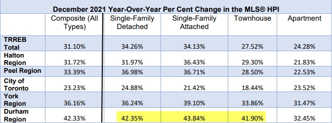
The City of Toronto has the lowest price growth across the GTA (though at 23% year-over-year it's hardly pedestrian). There have been plenty of "urban exodus" articles written since COVID began. That can explain some of why there has been crazy price growth in the suburbs as of late. Why are 39 people offering on subdivisions in Ajax (with one person paying $2 million for the privilege of living in a 1980s subdivision)?
But the bigger question I have is, are these suburban price run-ups sustainable? So to help answer that, I looked at historical prices in all of the four surrounding Regions (as a whole, and in some sample municipalities in each region). To me the prices seem to be getting a lot closer to Toronto prices. Was I imagining things? Are we at new highs? What do the price rations (suburban to Toronto) look like when viewed in historical context?
Durham Region: to the moon ![🚀]()

This was the first place I wanted to look into, because people are tripping over one another to drop boatloads of money on places to the east of Toronto. If I'm driving east along the 401, the order I drive through Durham is Pickering (on the Scarborough border), Ajax, Whitby, Oshawa, Clarington. It thins out a bit after that. Oshawa has the largest population in the region, so I picked that one (this is what I did for all four major surrounding regions).
Oshawa
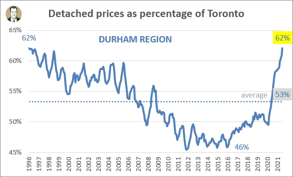
Durham Region
Population (2018): 169,500
Distance to Toronto: 62 km *
Average detached price: $928,800 *
* For distances I will use the distance per Google Maps to drive from the municipality's city hall to Toronto's city hall. For prices I'm using a rolling 6-month average to knock out weird blips you get from low volume months in the summer and winter. So I have monthly price info back to January 1996, but my charts don't start until at least June 1996 as I waited for 6 months of data.
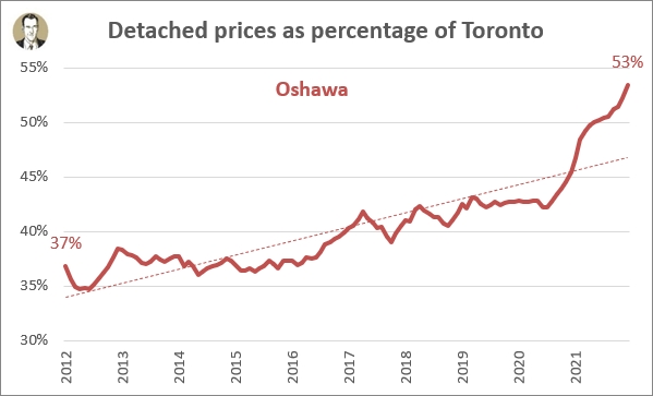
On my charts, I'm switching from HPI to the average prices, simply because I have monthly average price data back until January 1996. So above you see Oshawa's average detached house price expressed as a percentage of Toronto's average detached house price for each month in the last 10 years. Ten years ago it was in the mid-to-high thirties, and then in November 2016 (in another housing market boom time) it crossed over the 40% threshold. But holy hockey sticks, Batman! Look how it has shot up recently. Now the discount to move 60 km away is less than half. Oshawa happens to be the cheapest of the "Big 5" municipalities in Durham. The other four range from $1,218K in Pickering (closest to Toronto) to $1,037K in Clarington (east of Oshawa).
The reason I'm using detached in this analysis is because I don't want to get into shifts over time between condo apartments and lowrise housing that distort the Toronto numbers. Detached I feel is the most apples-to-apples comparison. Though I'll note that the average age of a house you'll get in these suburban places is going to be a lot younger than the average sold house in Toronto, so it's not apples-to-apples in that regard. And obviously as you getting a lot bigger space for your money as you drive further away from the core.
When I see this chart I tend to think there will be large regression to the mean, or the longer term average. So once some sanity returns to the market, I'm thinking either Oshawa prices fall, or they stagnate while Toronto prices continue to climb and we'll see that ratio ease back to "normal levels." The alternative is that there is some sort of New World Order at play here and these high ratios will be the new norm. Personally, I don't think we're in a NWO. I think people sometimes forget that this pandemic is not permanent. I obviously don't know how long it will be until we're "back to normal" but I think a lot of people made kneejerk decisions to bail on Toronto during the pandemic. That's a lot easier to do if you're a renter and stakes are low, but we saw it in resale housing too.
We'll see how this plays out. To get a sense of what "normal" is with this price ratio, here's the full view using data back to 1996.
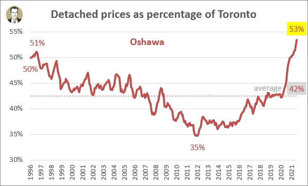
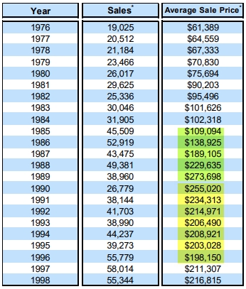
So the 53% is definitely high as you can see the average over this whole 26 year period is 42%. But it's not the first time over 50%. I really wish I had another 10 years before this so we could see the late 1980s spike and 1989 peak, then the early 1990s price declines, as seen below in TRREB's Historic Statistics report.
Unfortunately (suspiciously?) TRREB only has monthly data back to January 1996, after which the market has pretty much been constantly moving upwards in price. The only negative YoY change period after 1996 was from 2017 to 2018. It's important to note that's on a regional aggregate average price, with a fluctuating mix in locations and housing types.
Anyway, I wasn't working 30 years ago to have seen that prior rise and fall, but one guess is that there are similar reasons to now as to why Oshawa may have been inflated then. That is, Toronto prices had shot up a lot and had become unaffordable to many, so people went further out. So that 50% you see at the left hand side of the Oshawa chart (June 2016 rolling 6-month average detached price) is a hangover from high Toronto prices. And then things settled back closer to the longterm 42% average.
Let's zoom out a bit and look at all of Durham Region. I'd mentioned above that Oshawa was the cheapest part of it. The longterm chart for the whole region pretty much mirrors the Oshawa chart, just at a higher level. So the 62% this price ratio sits at now is a big jump from where it was sitting heading into 2020, but actually very close to where it was sitting in 1996. Durham is sitting 9% above its longterm average (62% vs. 53%), while Oshawa is 11% above (53% vs. 42%).
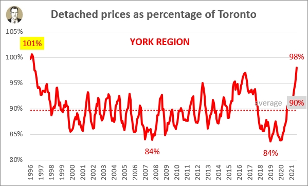
York Region: the expensive one
Moving around counter-clockwise, we come to York Region. In the 2016 census it had a population of just over 1.1 million, and is expected to grow to 1.5 million by 2031. The largest municipalities within it are Markham, Vaughan, and Richmond Hill. I've chosen to drill down on the largest city, Markham, and also the rapidly growing Town of Newmarket (which I personally saw clients of mine make an "urban exodus" to in 2020).
Markham
York Region
Population (2016): 329,000
Distance to Toronto: 28 km
Average detached price: $1,821,600
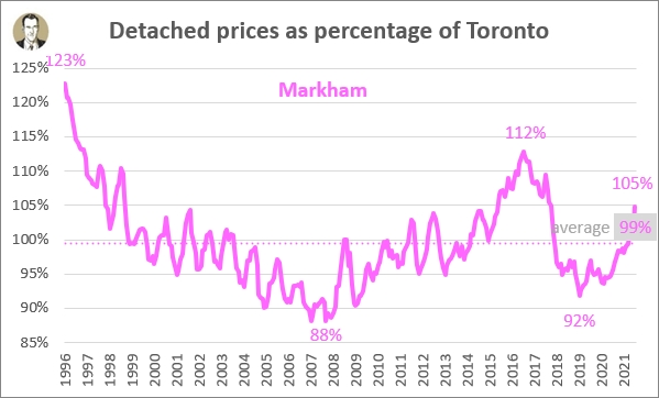
Is this the most bubbly area in the GTA? Not in how high the current number is, though things are sitting above the average right now (105% vs. 99%). But more like how every time the market gets frothy (I'm looking at you 2016 and 2017), Markham goes full steam ahead. But neither of these two recent peaks holds a candle to the 123% that this chart starts at.
Newmarket
York Region
Population (2016): 84,200
Distance to Toronto: 55 km
Average detached price: $1,314,200
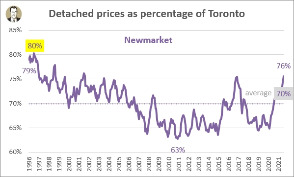
Newmarket seems to go pretty much where Markham goes, just at a lower magnitude. Which makes sense since it's twice as far to downtown Toronto. Newmarket is sitting at the same 6% above its average that Markham is, but also it's closer to its 26-year peak of 80%.
Of the four major regions surrounding Toronto, York Region is closest in average detached prices to Toronto. In fact, in 1996 it briefly surpassed Toronto and is looking to be on a trajectory to overshoot again.
Part of why I'd think York should be trending upwards is that there are a lot of new houses continually being built there. A 2020 house should be worth more than a 1990 house which should be worth more than a 1960 house. And of course (and this goes for all of the suburbs), the lot sizes and house square footage is larger too.
Peel Region: go west, young man
Brampton is also a major centre here (675,000 population), and it also contains Caledon (73,000). But Mississauga is the 6th largest city in Canada and is directly adjacent to Toronto (roughly the boundary is the 427), and its city centre (the City Hall is right beside Square One) is closest to Toronto's so I chose it to look at.
Mississauga
Peel Region
Population (2018): 754,200
Distance to Toronto: 27 km
Average detached price: $1,587,300
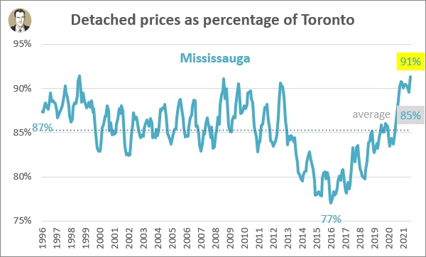
Again we have a city above the longterm average, and this one is a high level, tying the 91% heights reached in January 1999, January 2009, and January 2010. It has been a pretty rapid rise from 78% in July 2017 to 91% four and a half years later (about 1% every 4 months). Peel Region's curve is very similar, which makes sense since Mississauga is just over half of the region's population.
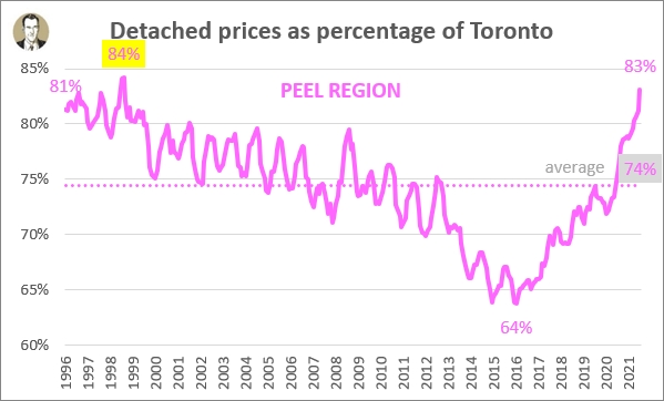
But the region is actually 9% above the longterm average, while Mississauga is "only" 6% above, suggesting Brampton is probably more out of whack right now. Brampton is actually the 9th largest city in Canada, so that's some significant population centres in this region.
Halton Region: go further west, young man
This is an interesting region. You've got Oakville, the rich one with 35% of the region's population (194K). Moving west on the QEW you've got Burlington at 34% population share (183K), and then Milton to the north with 20% (110K). Milton's an interesting case, being one of the fastest growing cities in Canada (growing 31% from the 2011 to the 2016 census). Halton Hills is the other 11% of the population (61K). But sticking with the top pop thing I've got going on, I chose Oakville, which sticks out in my childhood memory as having the quirk of being a local phone call even though it wasn't directly adjacent to Toronto (like say, Mississauga, Thornhill, or Pickering).
Oakville
Halton Region
Population (2016): 193,800
Distance to Toronto: 38 km
Average detached price: $2,205,500
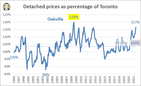
You can see that over the course of the last 26 years, Oakville has actually averaged higher detached prices than Toronto (104%). It had TRREB's third highest median detached sales price in December, behind only King City and Uxbridge. Where it gets really expensive is down by the lake. I mean, Toronto Life once published an article entitled "Who lives where along Oakville's astronomically expensive waterfront," because of course they did. There are currently 4 properties for sale over $10 million right now, including this one with 101 feet of frontage listed at nearly $22 million. That admittedly skews the averages a bit. So while the December 2021 average detached sale in Oakville was $2,135K, the median was "only" $1,899K. (Remember my charts are using the rolling 6-month average price, which is $2,205,500.)
The thing that stands out to me in the above chart is that the other municipalities peaked relative to Toronto either currently or at the beginning of the chart in 1996. However, Oakville's peak of 120% was in December 2008. Not too coincidentally the global financial crisis was taking shape then, with Lehman Brothers filing for bankruptcy in September 2008, and the Dow Jones suffering its largest single day points loss on September 29, 2008. There are a lot of Bay Street executives that live in Oakville so my hypothesis is that's why average prices were peaking when the stock market was going great. The high point was in December because remember, I'm using a 6-month average, and also house prices are sticky on the way down.
Zooming out to the regional view, Oakville didn't seem to exert as much influence at the beginning of the chart back in 1996, as Halton was at a high, and Oakville was actually 4% lower than its longterm average. As much growth is coming from Milton, Oakville should have a lesser influence in outer years as well.
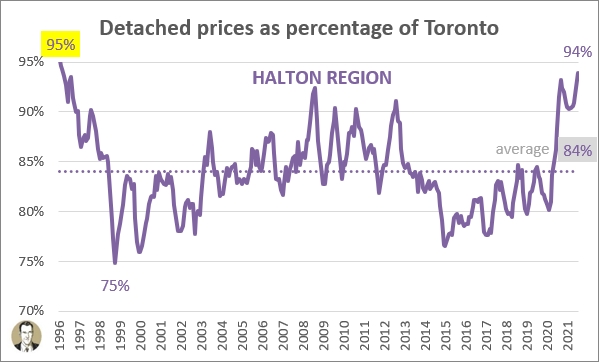
Halton is yet another region above its longterm average (+10%) and at or near its peak (just 1% off).
Hamilton: it looks a lot like Hammertime
I've been keeping an eye on what's been happening in Hamilton. One reason is because I lived in the city when I went to university. And the other is that I have several friends in recent years that moved there. As such I have established a great working relationship with Donna Bacher (a good follow on Twitter). She was kind enough to supply me with monthly detached averages going back to 2011 (so not quite as far as the 1996 I have from TRREB, but I'll gladly take it).
Hamilton
Halton Region
Population (2016): 536.900
Distance to Toronto: 68 km
Average detached price: $751,800
Now, I'll note that I requested just the old City of Hamilton (incorporated as a city in 1846, just 12 years after Toronto). As part of a provincial reorganization of municipal boundaries, Hamilton was expanded in 2001 to include the former towns of Ancaster, Dundas, Stoney Creek, and the former township of Glanbrook. So the population numbers above are from the broader area, but my real estate figures only include East, West, Centre, and Mountain). Got it? Here's what it's looked like:
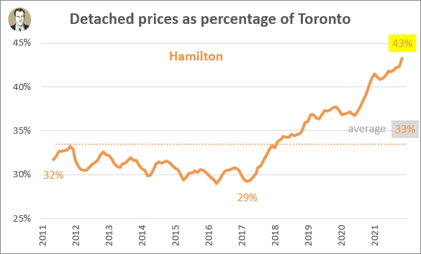
So the best time to move from Toronto and buy there was up until about 2017, when prices were about 30% of what they are in Toronto. I mean, even at 43% now it's still way more affordable, which is why one or two of my friends moves there every year. I wish I had the further price history here, but my guess is Hamilton was not at a high compared to Toronto in 1996 as many of the other municipalities and regions were. The steel industry was really hurting in the 1990s, and at the time it was a huge part of the local economy. Tons of jobs were shed in the 1980s and 1990s. Stelco went from 26,000 employees in 1981 to 14,000 in 1990. By 1993 that was down further to 9,700 (source). So with the local economy stagnating (at a period where local incomes were a lot more tied into housing prices than they are now), I'd wager Hamilton's real estate market was hurting in the 1990s too.
Of all of the places I've shown, I believe Hamilton is the most likely to keep this higher relative value (i.e. that it's in a new world order). Just because there is so much positive urban renewal and growth going on there, like the major Light Rail Transit initiative and the Pier 8 redevelopment in the West Harbour. A lot of my friends skip right over Mississauga, Oakville, and Burlington partially because they're costlier for being closer to Toronto, but also because they're a lot more "suburban" feeling and Hamilton feels like (and is) a real city (warts and all).
It has definitely been benefitting from intraprovincial migration (people moving from within Ontario), as well as international migration. You can see below that the most recent two years (ending on July 31st) had huge intraprovincial gains to the Hamilton CMA (which includes Burlington and Grimsby), but that those numbers have been net-positive for over 20 years. That's another reason I see Hamilton's relative price gains are sustainable.
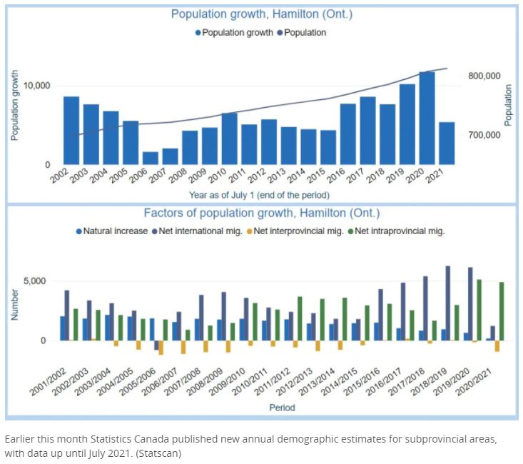
chart source: CBC Hamilton
Regional round-up
Here's what the 6 municipalities look like all together:
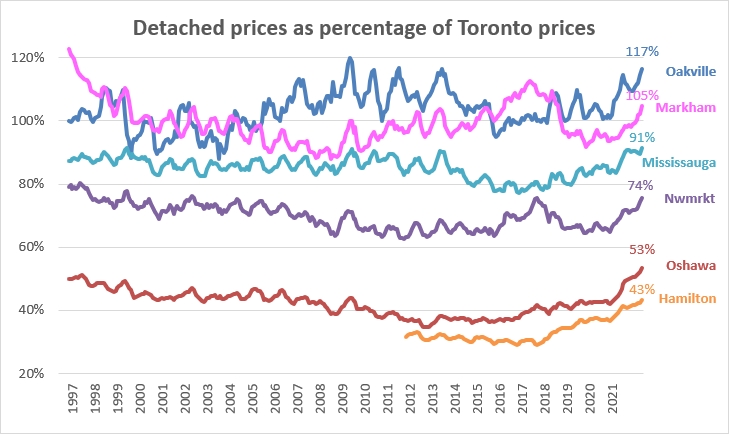
Some things that stand out to me:
- All of these 905 areas have turned up in the last couple of years
- The rise of the 2016/2017 York Region bubble via the Markham and Newmarket stats, with Markham even jumping over Oakville for a bit
- The high ratios at the start of this chart in the mid-to-late 1990s
Let's take a look at the 4 surrounding regions (parts of Simcoe and Dufferin counties are under TRREB but combined they account for less than 4% of TRREB's total transactions so I generally leave them out). I first want to zoom in on the last six years:
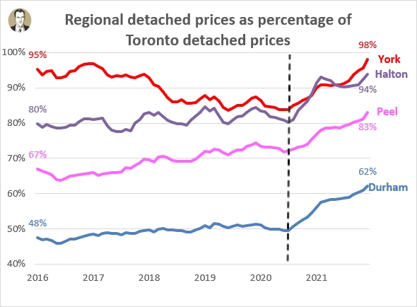
And I especially want to zoom in on the last year and a half, from that arbitrary dotted line I threw in. The climb in relative prices for all four regions from that point is pretty remarkable to me. I also not that all four are much higher at the end of 2021 than they were at the beginning of 2016 (or 3 of the four are much higher and one is a little bit higher):
- +16% Peel
- +14% Durham
- +14% Halton
- +3% York
But of course those are arbitrary beginning and ending points. So here's a longer term view:
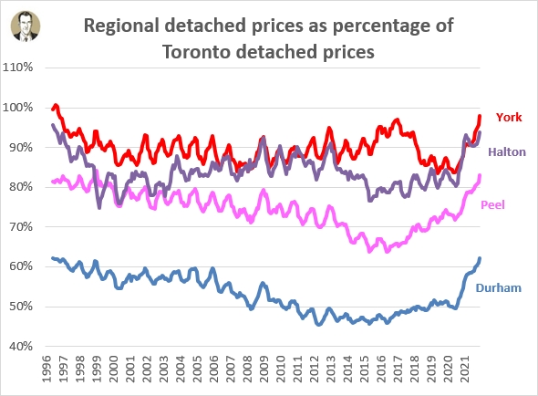
Now of course 1996 is also an arbitrary end point, but It's all I have to work with. The big takeaway for me from these is that all of the 905 regions are currently above their long term relative price averages by 8% to 10%:
- +9.9% Halton
- +8.8% Durham
- +8.6% Peel
- +8.3% York
And Hamilton is 9.8% above its 2011 to 2021 average.
So back to the sustainability question
Do I think the current prices are sustainable? As to the dollars and cents values, sure. But I guess what I'm really asking is are the relative prices sustainable. I find these things tend to stick to ratios. For example, one of the charts I track in my Monthly Market Charts is the ratio of detached prices to condo apartment prices. That ratio goes up and down but it usually sticks in and around 2:1 (i.e. average detached costs twice as much as average condo apt, or condo apt is 50% of the detached price). In February 2017 this ratio peaked at 3.06. But as you see below, it came back over time to its normal 2.00 (+/- 0.25).
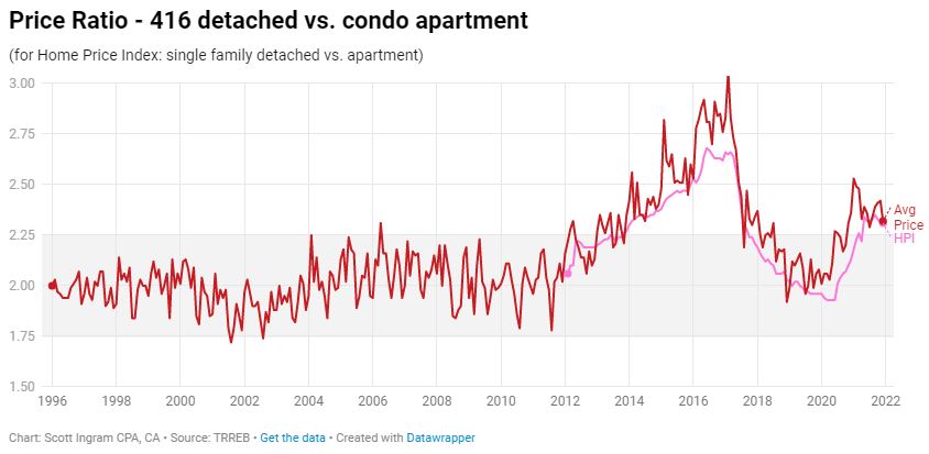
This is what I imagine will happen with these 905 prices. They're running high relative to Toronto right now, but over time - whether that's via 905 declines, relatively higher 416 price acceleration, or a combination of things - I think these ratios will settle back towards the long term averages. The only reason I could see for them staying at their current elevated levels, as I said at the top, is if there is some kind of New World Order now. Work from home is a new reality that could contribute to a NWO, but I think most employers will be pulling people back to their offices (it was already starting before Omicron). So maybe that Whitby lifestyle looks a lot less attractive if you've got to hit the 401 for four or 5 days a week again.
The City is always going to have the pull of the sports and entertainment and the best restaurants (and more choices for restaurants). That's why it's always been more expensive. People trade location off for size and we definitely saw people covet space (and outdoor space) more during COVID lockdowns. But is that a permanent shift?
Family-aged households have been net-leaving the City of Toronto for the suburbs for years (to be back-filled and more by incoming international immigration), so that's not a new thing. Yes the intraprovincial and interprovincial (Hello, Nova Scotia!) has ramped up during the pandemic. But again, the pandemic isn't permanent. People's lives returned to normal after the great 1918-1919 influenza pandemic and though things can spread more rapidly now with global travel, we're also a lot more scientifically advanced now too.
One other factor I'll bring up is the absolute dollars involved. That could be a factor. For example, Newmarket's rolling 6-month average is $424K cheaper than Toronto. Oshawa is $810K cheaper. That's a big difference to your required down payment and your mortgage. Though I'll mention at the end of 2016 the Newmarket difference was $369K and the Oshawa difference was $766K, so the differences for both have "only" grown about $50K over 5 years. But at some point people are just plain absolute dollar priced out.
Anyway, all this will take a while to play out, and I don't expect the ratios to go back down as quickly as they shot up in 2020 and 2021, but my bet is that they'll ease back down towards the historical averages.
Blog post cover photo by Dillon Kydd via unsplash
About Scott Ingram CPA, CA, MBA
Would you like to make better-informed real estate decisions? I believe knowledge is power. For that reason I invest a lot of time researching and analyzing data and trends in the Toronto real estate market. My Chartered Accountant (CPA, CA) side also compels me to perform a lot of due diligence work on properties my clients are interested in purchasing. If you have better information, you should have less risk and be in a position to make better decisions on the hundreds of thousands of dollars you're transacting on.
Your home is the single largest investment you'll make - trust it with an accountant.
Post a comment