

This is the second post in a two-part series taking a deep dive into 2018 neighbourhood statistics. The first part listed Toronto's most and least expensive neighbourhoods. This post will look at where prices are rising and falling the steepest. The last time I looked at this was back in 2016. There were some steep risers that year - over 15 hoods with 30% year-over-year price growth. The lay of the land is a lot different now.
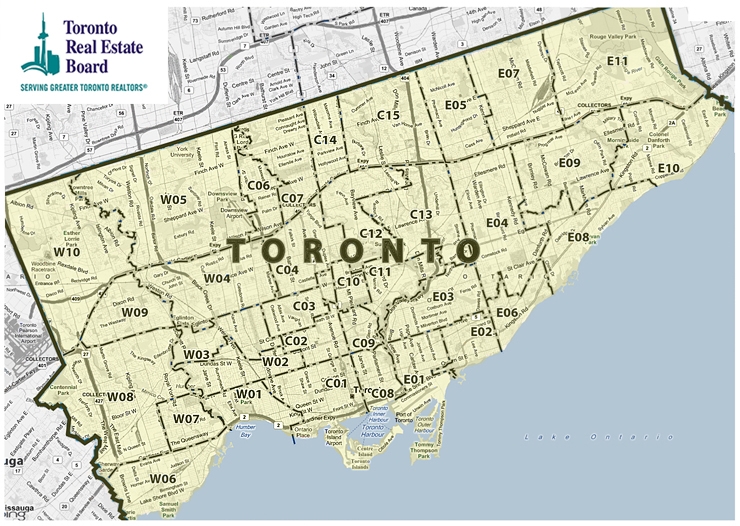
In this analysis, I'm only looking at average detached house prices. It keeps things a little more apples-to-apples across the city. Detached is the most prominent housing type in the 416, and was 70% of freehold (non-condominium ownership) transactions in 2018. And again, I'm looking at all 144 TREB neighbourhoods, which are spread across 35 zones within the City of Toronto boundaries (49 west, 54 central, 41 east). You can find the below zone map here, where you can also click in for neighbourhood detail.
For list ranking purposes, I only included the 127 neighbourhoods that had 10 or more detached house sales in 2018. You'll find the 17 excluded neighbourhoods and some more notes on methodology at the bottom of the post.
Some city-wide context
For context, here's how the 416 detached average prices has progressed in the last few years:
2015: $1,047,400
2016: $1,252,300 (+20%)
2017: $1,421,000 (+13%)
2018: $1,321,800 (-7%)
The median detached neighbourhood last year (E01 Greenwood-Coxwell) had an average detached sale price of $1,053K. The MLS Home Price Index (HPI) single-family detached price for the City of Toronto averaged $1,105K for the 12 months of 2018.
The median neighbourhood year-over-year (YoY) increases for the last three years were:
2016: 19.6%
2017: 14.1%
2018: -3.3% (C10 Mount Pleasant East)
So that's a lot slower. Another way to show we're in a different world was that in 2016 there were only 2 qualifying neighbourhoods with declining average detached prices. In 2017 there was only 1 (note this is the average for all sales from Jan to Dec). In 2018 there were 84 neighbourhoods in negative territory, which is about 2/3 of qualifiers.
Is scarcity a factor for the hottest price increases?
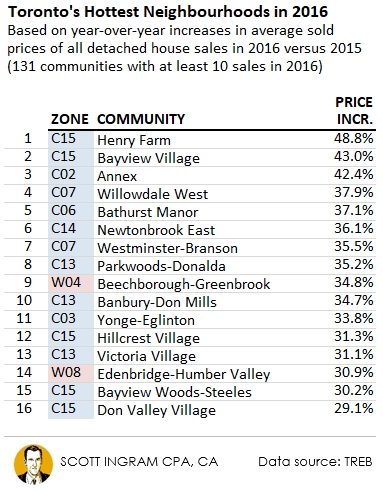
Here are the 15 neighbourhoods with the highest price growth percentage of 2018 over 2017. The top 6 all had around 20 transactions, which is why I made a point of showing the number of sales in brackets. The smaller you go, the more a few extreme transactions can affect the average (which is why I excluded neighbourhoods with <10 sales in the first place). So keep that in the back of your mind as you look at the list. The median neighbourhood had 49 sales in 2018. Note I'm using a colour code of blue for central, red for west, and yellow for east, and that I'm using top 15 lists because that's about 10% of the 144 official TREB neighbourhoods.

There's a pretty good representation from east to west on here, but the first thing that jumps out to me is that the top 4 are all central and south. And the small transaction volumes show you these are more rare property types. For example in Trinity-Bellwoods there were 96 total sales in 2018, of which only about 1 in 5 were detached. People prefer to not have party walls and will pay a premium for that. In denser downtown neighbourhoods, due to the scarcity of this property type, it appears there's a larger premium (and a growing premium).
The only neighbourhood to make the 2016 list and the 2018 list is the Annex (which was #3 in 2016). It's pretty interesting to re-visit the 2016 hotlist.
Hot has migrated south
Here's what the hot hood list looked like 2 years ago:
The first thing I notice about this list is how high the numbers are. The fastest gainer in 2018, Trinity-Bellwoods with a 28.0% increase, wouldn't even make the top 16 in 2016! Those were crazy runaway times we can see now. In 2016 there were only 10 qualifying neighbourhoods with under a 10% increase. In 2018 only 8 were higher than 10%.
The second big thing I notice is the location difference on these two lists. In 2016 14 of the 16 are north of Eglinton, and 9 are north of the 401. You'll see several of these in the cool list in a minute. In 2018, everything has shifted southward. Now, none of the hottest are north of Eglinton (except C10 Mount Pleasant West touches slightly above). And actually 14 of the 15 are south of St. Clair.
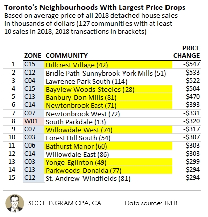
The 2016 hotlist is dominated by neighbourhoods central and north. Not so coincidentally those are the neighbourhoods with the largest average price drops from 2017 to 2018. The highlighted neighbourhoods were on the 2016 hotlist above:
Here's a list of the biggest dollar gainers from 2016, featuring many of the largest percentage gainers from above. This time I track how these neighbourhoods have done in the intervening two years.
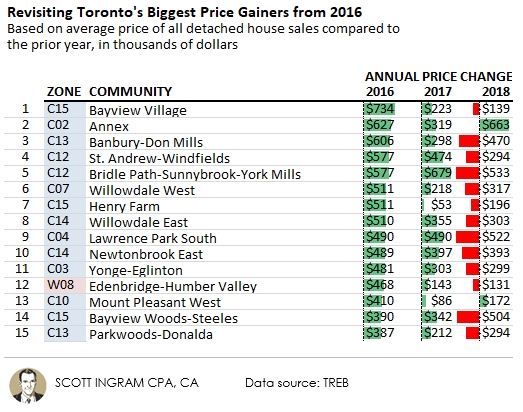
The overwhelming pattern is the 2016 big gainers didn't do so well last year. The two exceptions are the Annex (again) and Mount Pleasant West. Though the 2017 to 2018 drop-off looks ugly, if you look at the combined changes after 2016, 9 are up and only 6 are down (largest net post-2016 drop is Banbury-Don Mills at -$172K). But of course there may very well be further to fall. However, it's hard for me to see the entirety of the 2016 and 2017 gains being eaten into.
Have transaction volumes followed?
Anecdotally, the tear-down scene in the Yonge & Sheppard and Yonge & Finch areas are hurting these days, and this seems to line up with the list above (Newtonbrook and Willowdale straddle Yonge Street). You'll see a lot of these again below on the list of neighbourhoods that have seen the largest drop-offs in sales transactions compared to 2016. Five of these (all northern central) were on the 2016 hotlist.
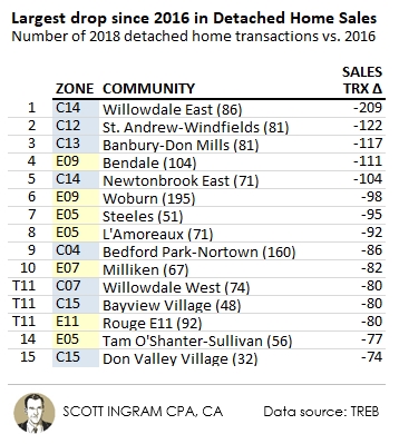
Three of the four Willowdales and Newtonbrooks noted above for their tear-down activity is on this list. The one that isn't, Newtonbrook West fell by 26 transactions. But Willowdale East is the astounding one to me. In 2016 it had more detached home sales than any other neighbourhood in the city, at 295. Here are the drop-off rates (2018 transactions compared to 2016, with the 416 total detached transaction number being -36% in that time period):
Willowdale East: -71%
Willowdale West: -52%
Newtonbrook East: -59%
Newtonbrook West: -25%
Harsh. This is similar to what I've been saying for a long time about parts of York Region: the places that went crazier on the way up are the places that are crashing harder on the way down. Perhaps another way to look at it is that these areas became the most detached from value fundamentals.
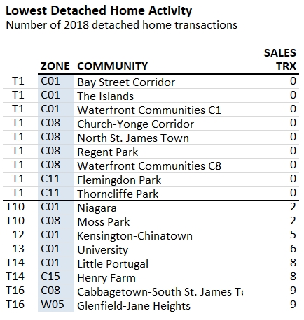
Other than noticing a lot of expensive central north neighbourhoods in the biggest volume droppers list, the number of east hoods jumps out (and there is nothing from the west). Like the north ones on the list, the east neighbouroods are predominantly north of the 401 (5 of the 7, with the other 2 in E09 being abutting the 401 from the south). But unlike the central hoods, these aren't pricey at all. All of them are below the median neighbourhood detached average price of $1,053K (only 1 is above $1M), and 2 (Bendale $751K and Woburn $726K) make the least expensive neighbourhood's list.
As mentioned, the overall detached volume has dropped 36% from 2016 (12,359 sales) to 2018 (7,907 sales). Comparing those two years, only 6 neighbourhoods have seen sales go up when comparing those two years.
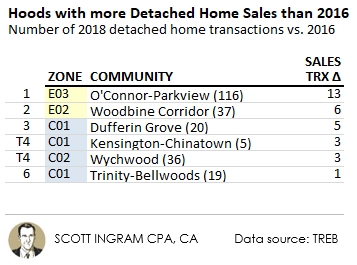
Once again it's south-central neighbouroods appearing to show strength. C1 Kensington-Chinatown could be a bit of a fluke since the number of sales are so low, and the other ones at 19 to 36 are super high either. The big mystery to me is E3 O'Connor-Parkview, tucked in just east of the DVP above Taylor Creek Park and bounded on the east by Victoria Park. I can't figure out what's remarkable about it. The average detached price is below the median hood price of $1,053K, but at $1,016K it's hardly cheap. About half of the sales in 2018 were bungalows. The median might give a better indication, as it was $853K.
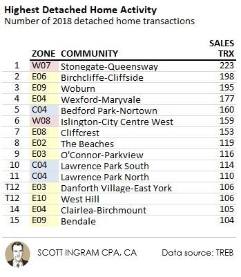
Ten of the top 15 neighbourhoods for sales were in the east last year (and all south of the 401). However, that's not crazy different from the 2016 list which featured 8 from the east.
And the largest dollar gainers are...
Here's the top 15. Once again the Annex is showing strength, and the top 4 are all central and south of St. Clair. (2018 transactions in brackets.)
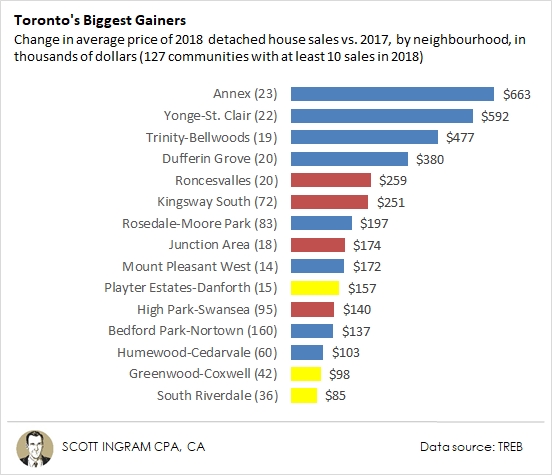
Again in a "how things have changed" vein, only the top 3 on here would've been large enough to make the 2016 list. There's representation from central (8), west (4), and east (3) here. Those west and east ones are all south of St. Clair.
The biggest losers
These shouldn't be much of a surprise if you've read this far.
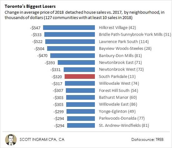
The list is dominated by north-central areas. With higher average prices, they have more room to fall. The South Parkdale one I think is a bit of an anomaly, given the low sample size (13 sales). In 2017 there were 4 sales over $2 million, including one at $3.34 million, while in 2018 there was only one sale that reached $2 million. The median went from $1.51M to $1.38M, so not nearly as harsh a downfall.
Here are the coldest neighbourhoods in terms of percentage drops. It features an overlap of 10 of the 15 neighbourhoods from above. It's kind of funny that the Bridle Path area could drop over $500K in average price but that's still too small on a percentage basis to make the list below.
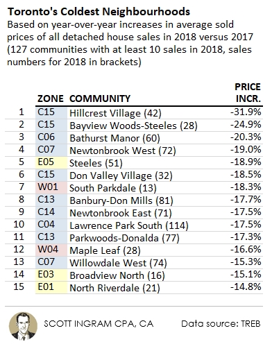
C15 Hillcrest Village is the undisputed King of Cold, topping the dollar value decline list and percentage decline list. It's located in the northeast corner of the central zones, between Leslie and Victoria Park, and Steeles and Finch. The majority of houses in this area are bungalows and backsplit/sidesplits and the median lot size is 50' x 120'.
The north-central neighbourhoods continue to look weak in the early bit of 2019. It will be interesting to see how long this coolness continues.
The Full Data Set
Here is the full list of the 144 TREB neighbouhoods ranked by most expensive in 2018, plus you can easily look your own up on the West, Central, or East tabs.
Notes on methodology
Data relates to the City of Toronto only (416). Only detached homes were used, to attempt the best possible “apples-to-apples” comparison. The “Top 15” lists exclude the 17 TREB neighbourhoods (of 144) with less than 10 detached house sales in 2018. Here's a list of that 17 (which for the most part are dominated by purpose-built rental apartments or condominiums):
► To share this post or to add your comments, scroll down a bit below.
About Scott Ingram CPA, CA, MBA
Would you like to make better-informed real estate decisions? I believe knowledge is power. For that reason I invest a lot of time researching and analyzing data and trends in the Toronto real estate market. My Chartered Accountant (CPA, CA) side also compels me to perform a lot more due diligence on properties my clients are interested in purchasing. If you have better information, you should have less risk and be in a position to make better decisions for your hundreds of thousands of dollars.
Your home is the single largest investment you'll make - trust it with an accountant.
Post a comment