

I last looked at this in 2016. Actually, in a 3 part series I looked at annual prices increases/decreases in each neighbourhood, most and least expensive neighbourhoods, and which hoods were quickest/slowest to sell. Everything in 2016 was on the upswing, and this time it's a little different so it was interesting to re-visit. So let's look at the current lay of the land, as well as what's changed in the last couple of years.
The same as last time, I decided to just use detached house prices, to keep things more apples-to-apples across the city. Comparing average prices across the city when one neighbourhood could be 90% condo apartments and another has 100% detached houses isn't quite fair. And some areas have more attached housing types (e.g. rowhouses, townhouses, semi-detached) in the mix as well. Detached is far and away from the most prominent housing type in the city (72% of freehold transactions in 2016, 71% in 2017, 70% in 2018) so seems the most appropriate. Also when I say city, I am once again concentrating on just the City of Toronto (i.e. the 416 area code, or places where the postal code begins with M). I would also use median prices if they were easily available since they're less influenced by extremely high or low sales, but the TREB data set I pull it from doesn't have medians so I use average prices. So let's get to it.
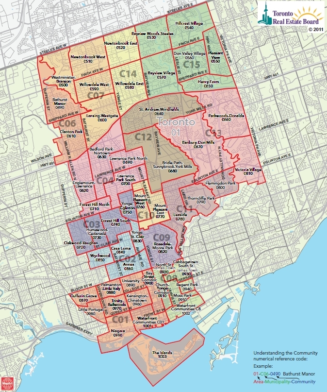
First, here's a map of the 35 TREB zones for Toronto:
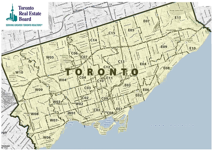
Within each of those zones, there are multiple "communities" in TREB's parlance, but which I'll call neighbourhoods. Here's how the 144 TREB neighbourhoods are distributed.
West: 10 zones / 49 neighbourhoods
Central: 14 zones / 54 neighbourhoods
East: 11 zones / 41 neighbourhoods
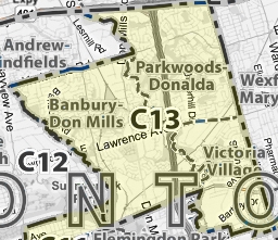
The above map is online here. To see a close-up of any of the zones to determine the boundaries of your own neighbourhood, just click on their map in the appropriate spot. For instance, this is what you see when you click C13:
Some city-wide context
For context, here's how the 416 detached average price has progressed the last few years (with annual detached volumes in brackets):
2015: $1,047,400 (11,985)
2016: $1,252,300 (12,359)
2017: $1,421,000 (9,509)
2018: $1,321,800 (7,907)
The crazy year was 2017, which you will remember things were all hot and heavy for the first 4 months until the Ontario government brought in the Fair Housing Plan and that was enough to radically alter the psychology of the market. So volumes dropped in 2017 by 23%, but average prices for all transactions that year increased by 13.5% (driven by early-year transactions). In 2018, detached volumes slide another 17%, and prices came down 7.0% year-over-year on price, but you'll notice they're still up 5.5% over 2016.
As a further comparison, this average price is different (higher) than the MLS Home Price Index (HPI) single-family detached price for the City of Toronto, which was $1,097,400 for December 2018 and averaged $1,105K for the 12 months of 2018.
Finally, before we get going on the extremes, let's touch on the middle. The median neighbourhood average price in 2016 was $970K (E1 - Greenwood-Coxwell). That was out of 131 neighbourhoods that qualified (I kept it to hoods where there were at least 10 detached sales in the current year and the prior year). In 2018, out of 127 neighbourhoods, the median average price has scooched up to $1053K (an increase of $83K). Funny enough it was E1 - Greenwood-Coxwell again.
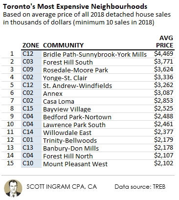
Bridle Path still King of the Grey Poupon Set
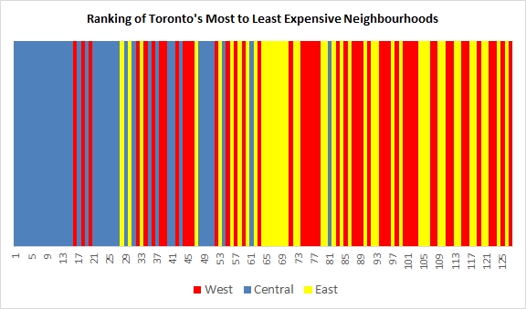
Here are the 15 most expensive neighbourhoods for average sold price in 2018. The top 15 are all in central zones by TREB's definition (throughout this I will use blue for central, red for the west, and yellow for east). I'm using top 15 lists as there are 144 official TREB neighbourhoods so that's about the top 10%.
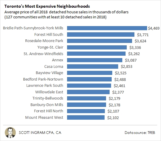
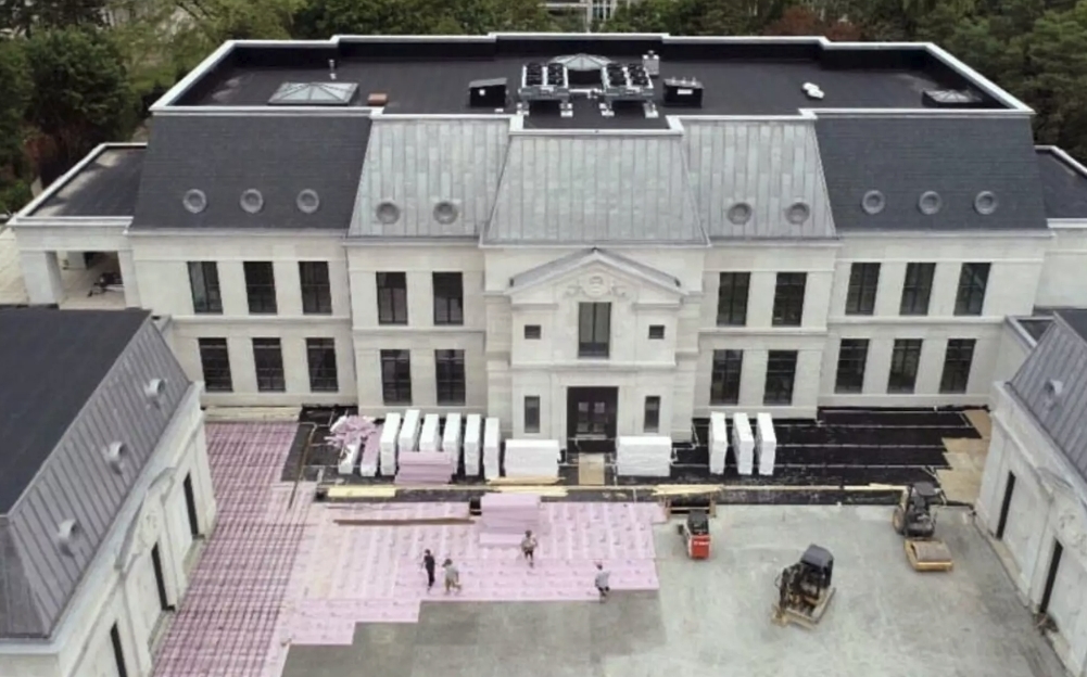
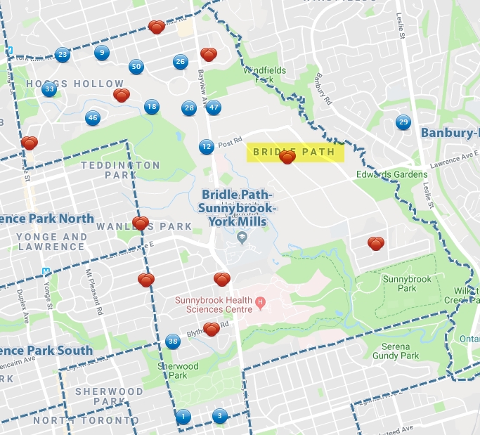
As I commented in 2016, the average prices in Bridle Path-Sunnybrook-York Mills get skewed due to really high priced sales (three of $9.5M and over, including one at $17.4M), but the median price of $3,990K is still greater than the average price of #2 Forest Hill South ($3,771K), so it's the undisputed prestige king - and likely why Drake is building his MASSIVE pad there, which is rumored to have saunas, hot tubs, a massage room, piano room, screening room, rewards room, jersey museum, 3 bars, an indoor pool and of course a basketball court.
What does an average-priced detached home in BP-S-YM in 2018 look like? Well here's one that sold for $4.5 million on a 50.5' wide by 130' deep lot on a quiet crescent south of Lawrence and west of Bayview.
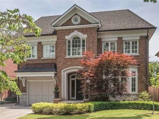
This one is actually on the far west part of this large TREB neighbourhood's geographical boundaries, right on the western border beside Lawrence Park South. The true Bridle Path area (only one portion of Bridle Path-Sunnybrook-York Mills, but the most famous one) is east of Bayview and straddling Lawrence and makes up a small percentage of the BP-S-YM area's sales.
Centre of it all
As noted above, the top 15 most expensive neighbourhoods are all central, which as you see below is more or less Dufferin on the west and Victoria Park or the DVP on the east.
Going further down the list, 24 of the top 27 are in the central areas. The first west representative is #16 W8 Kingsway South ($2,073K) and the first east representative is #28 E3 Playter Estates-Danforth ($1,739K). Furthermore, only 1 central neighbourhood is below the median, and that's C3 Oakwood Vaughan ($954K). It really sticks out on the chart below.
My hypothesis is people like being closer to the core and so prices will radiate from there (the same house 30 minutes east of King and Bay will be more expensive than 60 minutes east, which in turn will be more expensive than one 90 minutes east). The wrinkle is that rich people also like big-ass houses with big-ass garages for their dozen luxury automobiles, and big yards to play croquet on. So that's why the Bridle Path properties are more expensive than downtown because you get much bigger lots. Secondly, people like being close to the subway and 12 of the 14 central zones are on the Yonge-University subway line. And if you like to drive downtown instead, the DVP is on the eastern edge of the central zones (including the 2 that don't have subway access), and Allen Road is on the western edge of the central zones.
The Least Expensive List
It's interesting to look back and see as recently as 2015 the number of neighbourhoods with detached houses averaging $750K or less was about the same as the number of million-dollar neighbourhoods. But those counts have gone in opposite directions, with now only 13 neighbourhoods (less than 1/10 of the city) averaging $750K or less. Now a detached house will cost you over $1 million in over half of Toronto's neighbourhoods, and the number of $2 million hoods has tripled in 4 years.
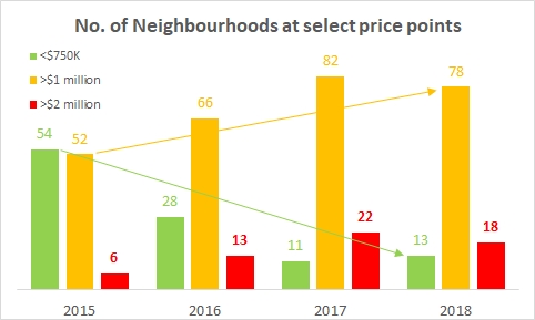
You'll see below that only 2 neighbourhoods remain in the 416 where you can buy a detached house for less than $700K. Just two years prior, in 2016, it was the same story but it was 2 hoods below $600K, and in 2015 they were both below $500K. Luckily these two most affordable neighbourhoods held steady (Mount Dennis) or slightly rolled back (Malvern) from 2017 to 2018. But how long will that last?
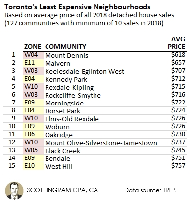
All of the above neighbourhoods are north of St. Clair Avenue with the exception of E6 Oakridge. Three of the top 15 are in W10 (Rexdale-Kipling, Elms-Old Rexdale, Mount Olive-Silverstone-Jamestown), which is the far northwest corner of the 416. In 2016 8 of the top 9 were in the west, now it's more balanced between west (5) and east (4). The scary thing is that $750K barely makes the "cheap 15" list now, whereas the chart near the top of this post shows there were 28 neighbourhoods out. You see above there were are 13 neighbourhoods
Weston has fallen from 9th cheapest in 2016 to just off the list at 16th by seeing its average detached prices climb $116K in just two years from $645K to $761K. I think a lot of that has to do with the Union Pearson Express train. The service began in June of 2015, but it didn't really take off until fares were slashed in March of 2016. It only takes 14 minutes (and $5.65) to get to Union Station and 11 minutes (and $5.30) to Pearson International Airport.
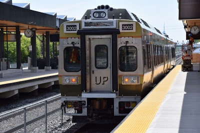
photo via: Glad Hobo Express
W4 Mount Dennis ($618K) is bordered by the railway tracks running diagonally on its east side roughly parallel to Weston Rd, reaches a little bit south of Eglinton on the south, and has the Humber River as its western boundary with Jane Street running north/south through the middle of it. The westernmost terminus of the Eglinton Crosstown LRT is on its edge (which is planned to be a big transit hub including a stop on the Kitchener GO Transit line), and personally think this area has a good upside because of that. Here's what an average detached home looked like in 2018. This property is a bungalow on a 30' x 92' lot with 2 bedrooms and 1 bathroom and it was "ready for your personal touches," meaning it was an estate sale with carpeting and dated cabinets.
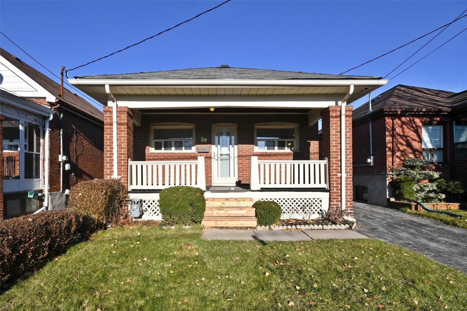
So it's not like you're even getting something great for that price (it was listed at $499K and was holding offers). And the sad thing is that I went to an online mortgage affordability calculator and pretended I was putting down 20% of a $618K house ($123,600) and it still said I needed about $155K in household income to be able to afford the mortgage on this - in the city's cheapest neighbourhood! (With zero assumed other debt like car payments or credit cards or lines of credit.)
It's amazing to me that not too long ago spending "half a million dollars!" on a house was big expenditure. Now you can't get an average detached house in the cheapest neighbourhood for that. Across the whole city last year, there were only 51 freehold properties (including detached, semis, rowhouses, vacant land, etc.) that sold for under $500K (11 were vacant land). That's less than once a week. Or there were almost twice as many people murdered last year (96) than there were freehold properties sold for under $500K.
Rankings Changes
Let's revisit the 15 most expensive neighbourhoods again:
Trinity Bellwoods is the largest ranking climber over 2016 that made the top 15 list this year, having climbed from 33rd to #12 this time. Yonge-St. Clair and the Annex are next having each climbed 6 spots to #4 and #6 respectively. You've obviously only got limited spots to climb once you're near the top. Banbury-Don Mills has dropped the most spots (4) to #13 and is only one of two on this list that has seen its average price fall versus 2016 at -$172K (Lawrence Park South is down 2 spots and -$32K).
It's interesting that 13 of the top 15 are up in value over my last list in 2016 because there's a perception that the top end of the market is suffering now. It's true that 7 of the 15 have dropped if we just go back one year to 2017 (including the Bridle Path down $533K). Still, 7 of 15 is less than half of THE MOST expensive neighbourhoods in the city, which have the farthest to possibly fall in price. Because this uses average prices, it's affected by the extremes. If you had a $7 million mansion would you want to put it on the market right now unless you had to? So I think less high-end supply is also contributing to less high-end sales (though many 1% ballers may be waiting out the high-end market to see if it drops more). Here's how sales activity in the top segments has looked in recent years:
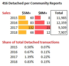
So in 2018, the sales of $5 million detached houses were cut in half from 2017. More importantly for affecting the average prices, the share of $5M and $8M places is down. But notice the shares in 2018 (e.g. $5M detached were 0.83% of all detached transactions) were still higher than in 2015 and 2016.
Here are your largest ranking climbers since I last looked in 2016:
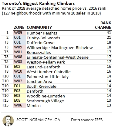
Humber Heights climbed from 96th all the way to 55th. This pocket lies just northeast of Royal York and Eglinton and is bordered on the east by the Humber River. There are some nice big lots out there, and more bungalows sold last year than 2-story houses. Trinity Bellwoods I've already touched on above, but you'll also notice that two other C1 neighbourhoods made this list: Dufferin Grove and Palmerston-Little Italy. I noticed that 11 of these top 16 climbers are located south of St. Clair.
I noticed the opposite in the ones that dropped the most ranking spots. In the below list, 11 of the top 15 (and the first 8) are all located north of the 401.
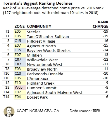
Only one was from the west, interestingly. For the most part, these aren't falling because they're pricey, either. One did fall from the 2016 top 15 list (C15 Willowdale West, down from 15th to 27th), but only 5 of these were above the median average price.
The Full Data Set
Here is the full list of the 144 TREB neighbouhoods ranked by most expensive in 2018, plus you can easily look your own up on the West, Central, or East tabs.
Coming next
Stay tuned for the second part of this series, where I show the biggest gainers and losers to see which neighbourhood's prices are rising or falling the most.
Notes on methodology
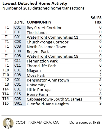
Data relates to the City of Toronto only (416). Only detached homes were used, to attempt the best possible “apples-to-apples” comparison. The “Top 15” lists exclude the 17 TREB neighbourhoods (of 144) with less than 10 detached house sales in 2018. Here's a list of that 17 (which for the most part are dominated by purpose-built rental apartments or condominiums):
► To share this post or to add your comments, scroll down a bit below.
About Scott Ingram CPA, CA, MBA
Would you like to make better-informed real estate decisions? I believe knowledge is power. For that reason I invest a lot of time researching and analyzing data and trends in the Toronto real estate market. My Chartered Accountant (CPA, CA) side also compels me to perform a lot more due diligence on properties my clients are interested in purchasing. If you have better information, you should have less risk and be in a position to make better decisions for your hundreds of thousands of dollars.
Your home is the single largest investment you'll make - trust it with an accountant.
Post a comment