

Are you curious how your house or condo has appreciated over time compared to the average in the city? Or how those average price increases look versus the stock market? Well then you came to the right place. I've been compiling this after the June and December market statistics are released. Here's where you can find the posts for Q4 2017, Q2 2017, Q4 2016 and the first primitive one I did for Q2 2016. I will show some of the charts in this blog post, but for the full picture, the entire set of numbers is available here on my website, or also on SlideShare.
For the love of Pete read this before you rage out on me: I'm not claiming this is a perfect comparison. Houses aren't a liquid asset like stocks or bonds. For most people a home is primarily purchased because we all need shelter. It's also a more emotional purchase (and sale) than buying a mutual fund for your RRSP. For most it's not a pure investment vehicle, though price appreciation is certainly a welcome benefit when it occurs. This is a simplified look, out of curiosity, and to give a rough idea of performance versus major market indexes. For a pure investment standpoint, a more apples-to-apples comparison would need to account for real estate transaction fees (e.g. land transfer taxes, real estate commissions, legal fees, etc.), which can be significant but percentages vary a lot from transaction to transaction. Stocks should properly include dividend re-investment and also transaction fees.
Dividend re-investment can easily add a few points to the stock returns. For example, using the S&P 500 index, the difference between the with and without dividends returns has averaged 2% to 2.4% when I looked over 20, 30, and 40 year periods (simple average, source). If those "total return" numbers were readily available I would use them. (If you know where they are, let me know.)
You'd also factor in that in Canada you don't pay income tax on any gains on your principal residence. But like I said, it's out. of. curiosity.
Finally, I'm using 20 years as the outer limit here because I only have monthly data from TREB from January 1996. I'm not trying to avoid a 30 year comparison to 1989 heights - I just don't have that data. I know 1996 coincides nicely with when Toronto real estate turned around, but I'm showing 5, 10, 15, and 20 year returns to show as many periods over as long a period as I can.
Rough year for the stock markets
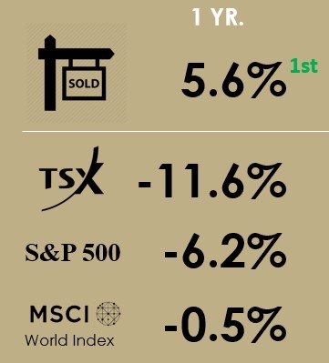
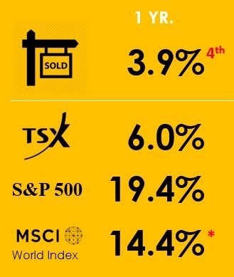
What's funny is that I just took last year's headline and changed "Strong" to "Rough." Here were last year's numbers:
But that's how these things go. In the GTA 2016 real estate had a record year in 2016 and in early 2017 prices were up 30% year-over-year (YoY). Then in 2017 things went south. The higher you go up, the further you have to fall.
The housing numbers compare all transactions in Q4 (Octo to Dec) versus Q4 the prior year. Keep in mind this "SOLD" sign represents all of Toronto real estate, so it's essentially a portfolio of all houses and condos sold in the 416 area code (from the western edge of Etobicoke to the eastern edge of Scarborough and everything south of Steeles). In that way it's much like the indexes on this chart, which are a portfolio of stocks (albeit a subset of top stocks). And like a stock index will have winners and losers, underlying that 5.6% 416 real estate portfolio number for Q4, condo apartments were up 8.9% YoY, while detached houses just kept float at 0.1% up. Last year's Q4 had 18.0% and -2.9% making up the aggregate 3.9% increase).
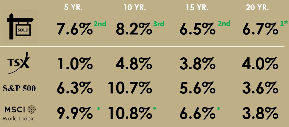
Toronto real estate shines in the long term views
Toronto Real Estate (dotted brown line is composite number) is very competitive in any view you take here. For the outer 11 years (CAGRs from 1997 to now or 2007 to now), Toronto Real Estate has the best return, or is at most 0.1% behind the MSCI. And as you can tell from the chart, it's a lot less volatile than the stock indexes. From the 4 year CAGR to the 22 year CAGR the composite operates in a narrow 2% bar (6.2% to 8.3%).
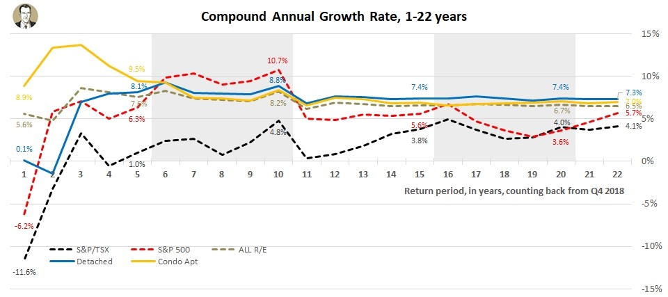
In the longest views, Toronto Real Estate is on top, though the timing coincides nicely with when the Toronto market began it's rebound from the 1989 bubble bursting. From it's peak in 1989, the annual average price in the GTA declined in 6 of the next 7 years. For 22 straight years from 1996 to 2017 the annual average GTA price increased, before finally falling in 2018. Note, my analysis just compares Q4 to the Q4 of prior years, while the average annual price would take in Q1 to Q4. It's been an exceptional 23 year run, which I wouldn't expect to repeat. Here's a look at some of the longer term CAGRs.
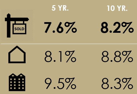
What's performed better, houses or condos?
The two most transacted housing types in the 416 are detached houses (23% of 2018 transaction) and condo apartments (55%), so that's why I've narrowed on them. As to which has performed better, the answer depends on your time frame. Given detached houses were negative in 2017 (Q4 vs. 2016 Q4), and flat in 2018 (+0.1% YoY), condo apartments have shot by them in recent years. In fact in a 1, 2, 3, 4, and 5-year return view, condo apartments outperform detached houses. The 6 year view is essentially tied, and detached houses outperform in the long run.
Last year at this time it was every view of longer than 3 years that favoured detached houses. Low available-for-sale numbers in the last 2.5 years have kept prices buoyant in the condo sector, but I still feel like detached will outperform in the long term. I see the two main factors for that being:
1) The supply of detached houses isn't growing in the City of Toronto, but there are more and more condos each day
2) The average size of condos has shrunk over the last 10 to 20 years. Pretend condos are represented by bronze medals (<600 sqft), silver medals (600-1000 sqft), and gold medals (>1000 sqft). There have been a lot more bronze medals added in the last 10 years. If you reached into a hat and pulled out 10 medals today, chances are you're pulling a lot more bronzes (the least expensive type) than you would've 10 years ago. So even if the average price of a medal has increased in the 10 years, that average price growth for the whole portfolio of medals has been held back by the number of bronzes.
TSX has been lame
When I first ran this report, I just compared it to the TSX. That's because we're in Canada and it's in Canadian dollars so it seemed the most relevant. But a good balanced portfolio would have US equities and international ones too, so I've added them over time. It gets too crowded if I shove all the stock indexes and housing types into the same chart, so if I ever compare to one index, I still go back to the TSX. That's not because it's been the lowest performer out of the three benchmarks I look at - it's simply because I think it's still the most relevant. So for heaven's sake I'm not trying to show how good real estate is by comparing to a lame index. I'm just presenting the numbers for what they are. If real estate currently sucked and the TSX was going gangbusters, I'd still present the numbers for what they are. So please can your conspiracy theories.
More chart fun
Again, these screenshots were just excerpts. For more charts (with exciting annotations! and proper image dimensions!), check out the full report on SlideShare or this website.
About the Indices
Descriptions per Wikipedia:
"The S&P/TSX Composite Index is the benchmark Canadian index, representing roughly 70% of the total market capitalizationon the Toronto Stock Exchange (TSX) with about 250 companies included in it. The Toronto Stock Exchange is made up of over 1,500 companies."
"The Standard & Poor's 500, often abbreviated as the S&P 500, or just the S&P, is an American stock market index based on the market capitalizations of 500 large companies having common stock listed on the NYSE, NASDAQ, or the Cboe BZX Exchange. The S&P 500 index components and their weightings are determined by S&P Dow Jones Indices."
"The MSCI World is a market cap weighted stock market index of 1,649 stocks from companies throughout the world... It is maintained by MSCI Inc., formerly Morgan Stanley Capital International, and is used as a common benchmark for 'world' or 'global' stock funds intended to represent a broad cross-section of global markets. The index includes a collection of stocks of all the developed markets in the world, as defined by MSCI. The index includes securities from 23 countries but excludes stocks from emerging and frontier economies making it less worldwide than the name suggests."
About Scott Ingram CPA, CA, MBA
Would you like to make better-informed real estate decisions? I believe knowledge is power. For that reason I invest a lot of time researching and analyzing data and trends in the Toronto real estate market. My Chartered Accountant (CPA, CA) side also compels me to perform a lot more due diligence on properties my clients are interested in purchasing. If you have better information, you should have less risk and be in a position to make better decisions for your hundreds of thousands of dollars.
Your home is the single largest investment you'll make - trust it with an accountant.
Post a comment